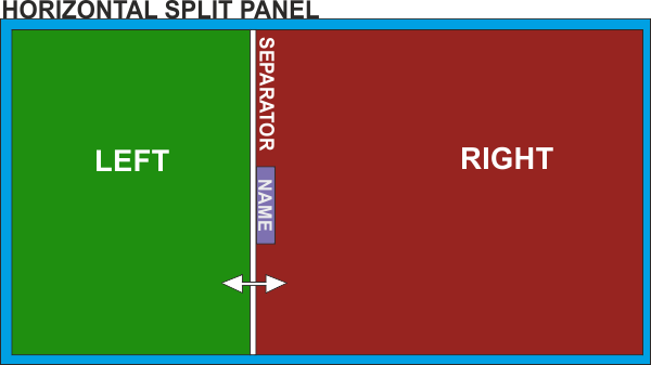
Split panel
Skin SDK: The <split> element
Split panels can be nested.
A typical example of (nested) split panels is the default Browser of VirtualDJ. See here how a Custom Browser can be created with <split> panels

Syntax :
<split name="" type="horizontal|vertical" [position=""] [grab=""] ><pos x="" y="" width="" height=""/><left|up>[nested elements]</left|up><right|down>[nested elements]</right|down><separator/></split>
Example:
<split name="loop" type="horizontal" position="0.6" grab="5">
	<pos x="17" y="144+92" width="400" height="200"/>
	<left>
		......
		......
	</left>

	<right>
		.......
		........
	</right>

	<separator close="right" closed="no" size="16"  />
</split>
Parameters:
- name : Provide a name for the split panel. The name will be used in the show_splitpanel 'name' action if you want to open/close the split panel with a custom/keyboard/controller button. The name will be also displayed on the separator button if no other graphics/icon/text is defined.
- type : Define if the panel will be split horizontally or vertically
- position : (optional) Set the X|Y axis % of the split panel area that the left|up section will get (50% by default), when the skin is loaded for the first time. If the split is resized, the new % will be stored and used across sessions. E.g. if position="0.8" then the left|up split panel will get 80% of the area leaving 20% for the right|down,
- grab : (optional) Define the width|height (for horizontal|vertical splits) in pixels that the mouse will offer the resize pointer. If not defined, the entire width/height of the separator size will be a resize-zone.
Children:
- <pos x="" y="" width="" height=""> : Define the X,Y coordinates , the width and the height of the area that the left-right|up-down splits will share.
- <left/> (or <up/> for vertical splits) : Nest inside <left> ... </left>|<up>...</up> all the elements you wish to display inside the left|up split panel
- <right/> (or <down/> for vertical splits) : Nest inside <right> ... </right>|<down>...</down> all the elements you wish to display inside the right|down split panel
- <separator/> : The separator can have the following parameters :[list]
- size="" : Define the width (for horizontal) or height (for vertical splits) of the separator area in pixels. If not any "special" separator button is defined (see below), the size defines how large the name of the split panel will be displayed on the default separator button.
- close="left|right|up|down" : Define the direction the split panel will close to. (left (default) / right for horizontal or up (default)/down for vertical splits)
- color="#FFFFFF|colorname" : (optional) Define the color (hex, html, rgb or a VirtualDJ pre-defined color) that the thin separator line will have.
- closed="yes|no" : Define if the split panel will be closed on first launch or not.
By default the separator will have a button with the name of the split to open/close. You can define your own custom separator button using the following children
- <size width="" height=""/> : Define the width and height of the separator button. No X,Y coordinates is required. The separator button will be automatically placed in the center of the separator line.
- <up x="" y="" /> : : Provide the X,Y coordinates of the graphics that will be used for the separator button
- <over x="" y="" /> : : Provide the X,Y coordinates of the graphics that will be used for the separator button when mouse is over the button
- <text /> : : Same as with normal <button> elements, you can display a text.
- <icon x="" y="" width="" height="" /> : : Same as with normal <button> elements, you can also overlay an icon
[/list]
Nested elements:
You can place nearly any skin element inside the <left|right|up|down>...</left|right|up|down> tags, <button>s, <slider>s, <visual>s e.t.c. Each one of the nested skin elements can have the following optional properties.
- resizeX="yes|no" : (for horizontal splits) Set to "yes" (default) if you want the element to be resized while the split is resized or set to "no" if you want the element to retain its size while the split is resized.
- resizeY="yes|no" : (for vertical splits) Set to "yes" (default) if you want the element to be resized while the split is resized or set to "no" if you want the element to retain its size while the split is resized.
- attachX="left|right|both|no" : (for horizontal splits) Set to "left" if you want the element to retain its X position compared to the left side or to "right" to retain its relative X position compared to the right side. If set to "no" (default), the X position of the element will be "resized" along with the split. Set to "both" (useful with resizeX="yes" elements) if you want the element to retain both its left and right distances from the left-right sides of the split.
- attachY="up|down|both|no" : (for verticalsplits) Set to "up" if you want the element to retain its Y position compared to the top edge or to "down" to retain its relative Y position compared to the bottom edge. If set to "no" (default), the Y position of the element will be "resized" along with the split. Set to "both" (useful with resizeY="yes" elements) if you want the element to retain both its top and bottom distances from the top-bottom edges of the split.
Notes:
- Split panels don't support <panel> and <group>, but can have visibility=""
- <pos x="" y=""> are relative to the x="" y="" of the split. E.g. x="10" y="100" when used in an element nested in a split panel, will place the element at 10,100 pixels inside the defined split panel and not from the 0,0 of the main skin.
- Make sure the width and height of the nested elements don't exceed the width and height of the split panel.


